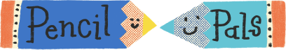
I have been thinking for a while that my Pencil Pals logo was looking a bit small in the context of my Substack page… it was hard to read the text and the bird and small envelopes were just clutter. Look 👆👀 It was nice, but didn’t make a good logo, not enough impact.
Old logo - too many small details
So I whipped up a new super simple logo on Procreate this morning. What do you think?
New simple logo
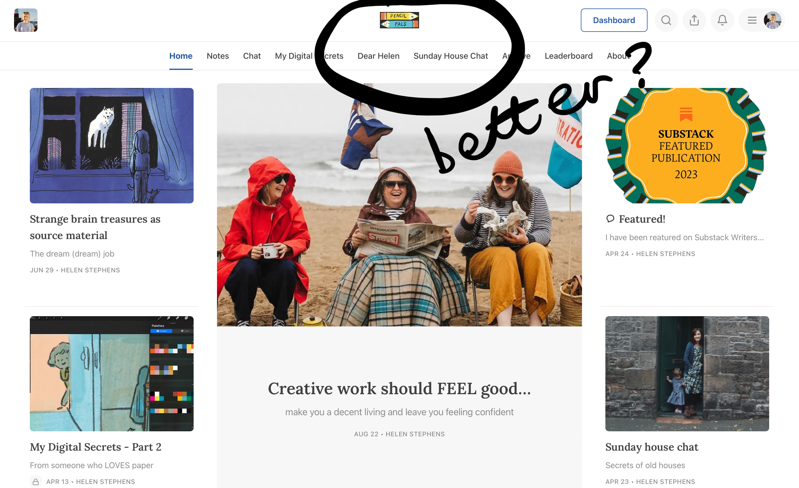
Here it is in context
Show me your Substack logo, I am curious! Are you happy with it? What do you think makes a good Substack logo?
Love Hx
(Can you tell I have a some emails to answer and have already washed up and watered the plants and am looking for other distractions? I always do my best work when I am hiding from writing emails 😂)
🌟🌟🌟 UPDATE ALERT!!! 🌟🌟🌟
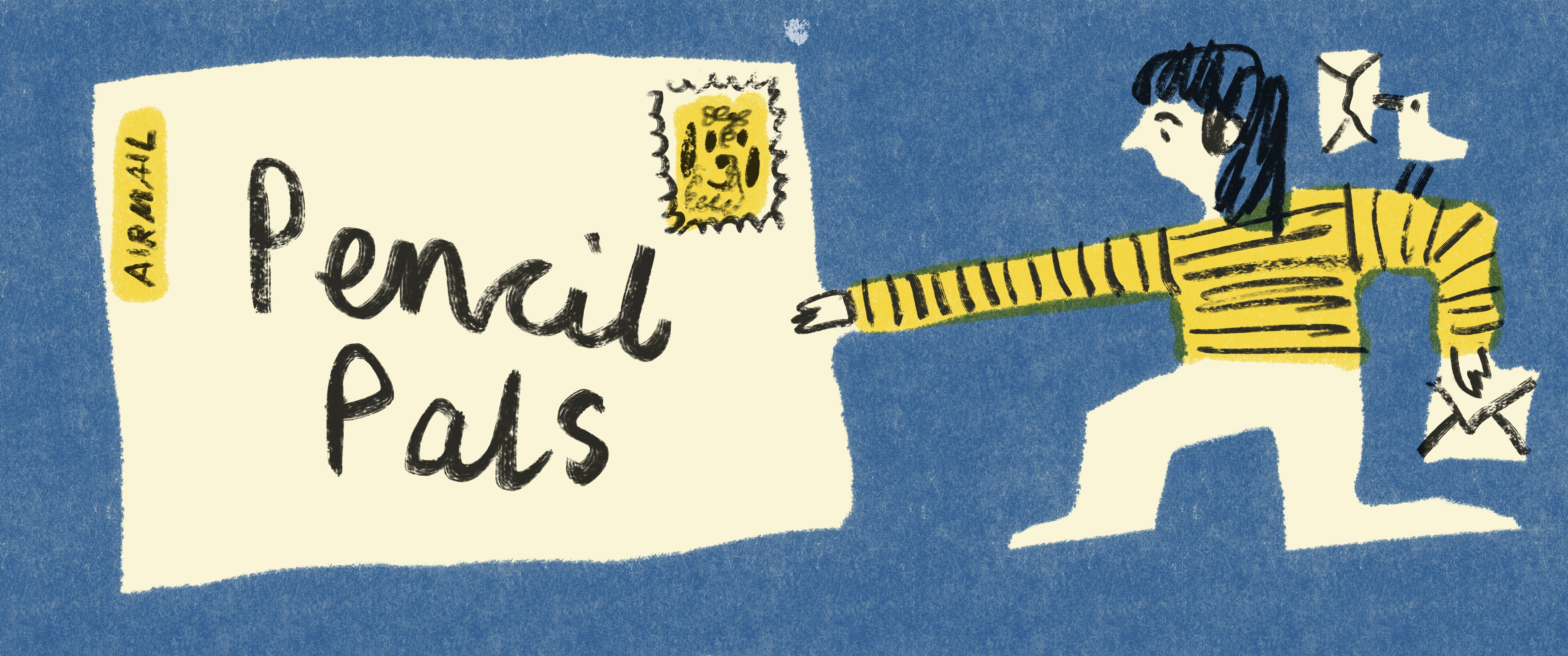
Adam Ming and Angharad Jones suggested I make the image wider, so I looked up the suggested dimensions and YES it can be a lot wider. I didn’t look at the suggested dimensions before hand because I am allergic to be being told what to do or reading numbers 🤪 But I am glad Adam and Angharad had a word with me. I fixed my design and here it is 👇 Much better!
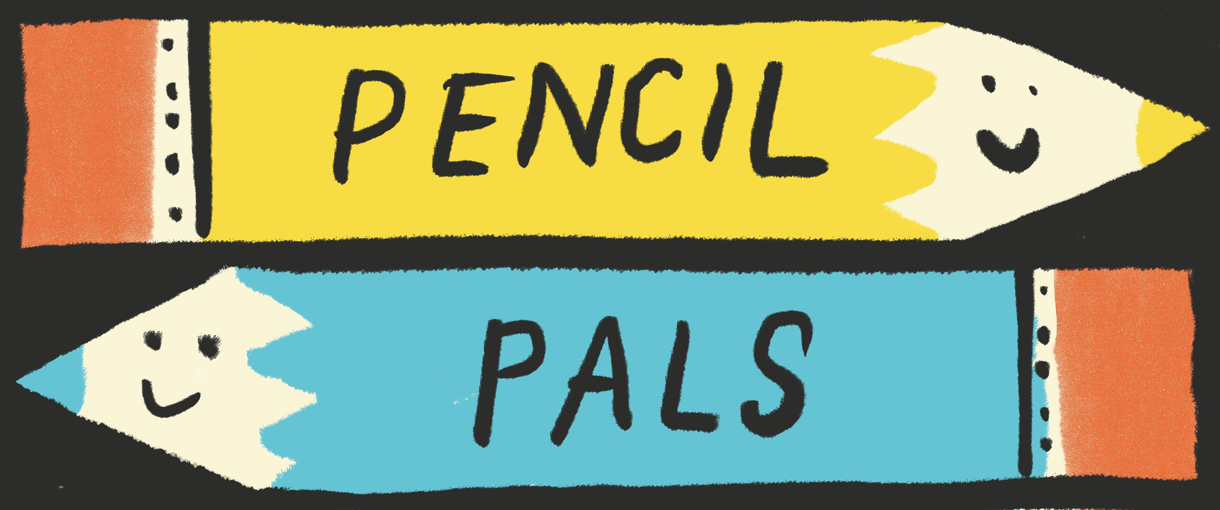
🌟🌟🌟🌟 FURTHER UPDATE 🌟🌟🌟🌟
Someone messaged me to say the first version (above) is filthy 😳😅
I did a quick redesign, will plonk it in soon and see how it looks. Thanks for getting me to look at the dimensions, I hate reading things with number in them 😂
It’s so fun! I love it and wish they’d give us a bit more pixels to work with. I put a tiny sleeping dog in mine when I started it, because there wasn’t room for my text! Now I think it just say “Hello!” Don’t worry, the pup is snoozing on my about page, ignoring all the typos by the sneaky kitten. 🐶💤
I just changed mine yesterday. I've only been on substack a few months but I had whipped up the original very quickly in my excitement to post so it was already looking tired. Mine is longer than yours but some seem to be much bigger. Not sure where I've gone wrong. Also going to investigate!
The pencils work great! Like them better than the previous logo, for sure! My little bat seems to work, it took me a couple of days to get its size right.
Amen to that. I think that there’s definitely a future for Substagram, or maybe Substackagram, or perhaps Subgram!? Or InstaStack...(sorry. I’ll stop now!!)
I love the wordmark thingy. I hadn’t heard or one before Substack. The new pencil pals header is much more eye catching Helen, really love it! I designed my own for While I Was Drawing a while ago and I am very please with how it looks - I won’t admit to exactly how long I spent on it though 😂😂 I tried to create something similar for my new publication, Counting Beans, but somehow it’s not quite a good. I think it’s not wide enough so might be in need of a little redesign..! 💛
Helen, I love the new logo design! The pencils are the perfect characters and they're facing each other communicating like pals would. The colors are eye catching on the black background and they fill the space just right. I also love your Substack and look forward to seeing it appear in my inbox!
I like the new wider nose-to-nose one. It does seem a very small size allowance though. I made one but it won’t upload. I’m doing something wrong somewhere... 😂
I love both designs Helen but the pencils are so fun and catch my eye! I took the lazy route and used Sara Tasker’s Substack Branding Bundle! It was so helpful! Canva templates with all the sizes set up!👌
Ooh it's fab! Mine was a rush job to get started on here. Def needs more thought in due course. Also, don't understand why mine only shows up on emails, not when you look via the website. Newbie here!
Just realised I can make mine much wider, having a quick resign already! Ah yes, you can find the email header in the setting and the homepage image settings in another section. We are getting there bit by tiny bit! 😂
reckon I might delegate this stuff to my son (13) - he's just built me a whole new website on Substack, while I'm still trying to find out how to do buttons on Stories!
Hello, I am just starting out. I haven't even published something, because I wanted to get my space looking just right. (Yes, this is starting to feel like MySpace in the best way possible). I feel like mine still looks too small. Any suggestion on what size to use? Thanks ahead of time for any advice!


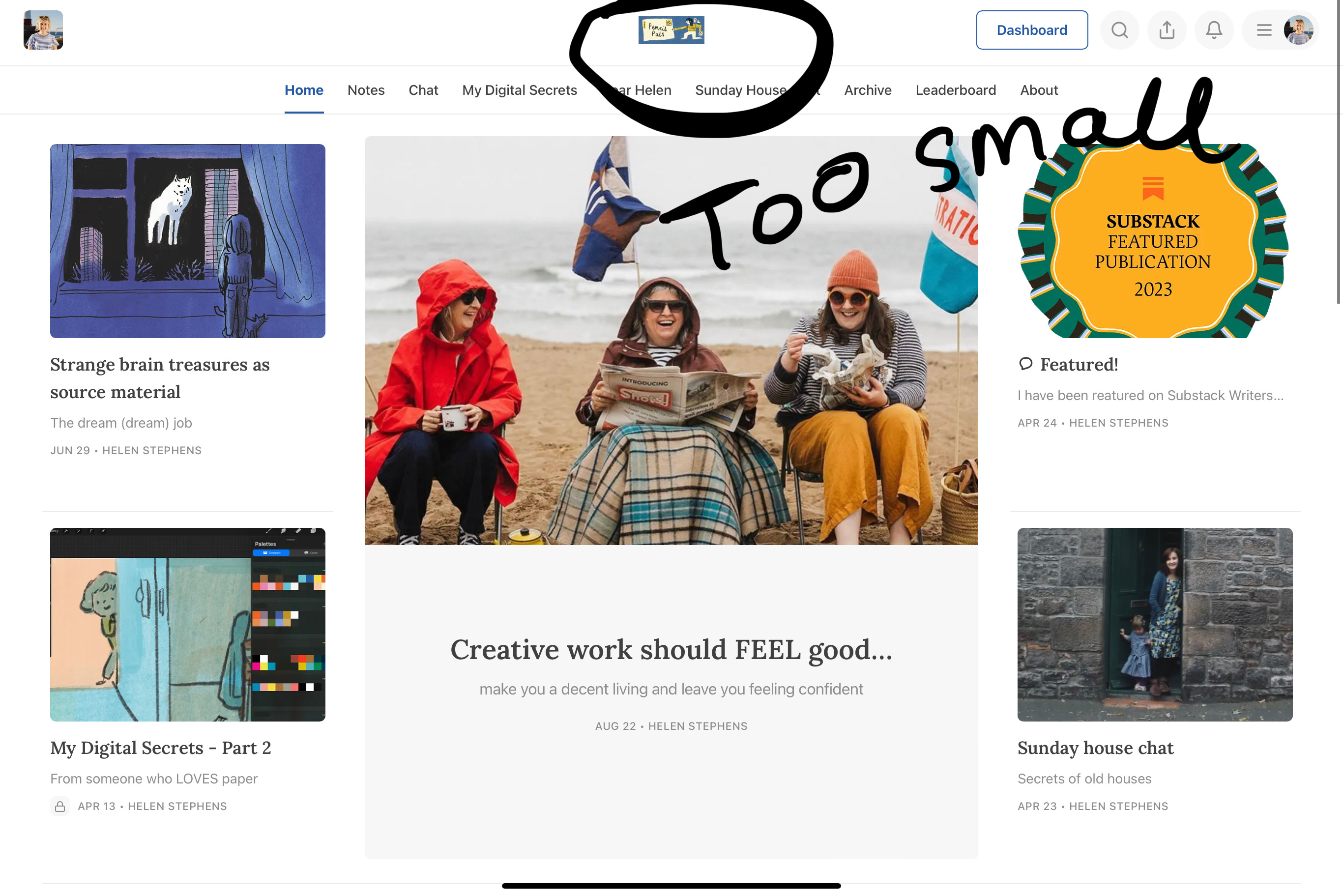

It’s still too small, I think it’s the dimensions, could it be longer?
Maybe you’re right, it could be longer! I am gonna have a quick look at the suggested dimensions. Thanks Adam!
I looked and it can be 1344 x 256 pixels, so it can be waaaay wider! Why didnlt I look at that before? 😂
I struggled with it for a long time too! I think both your logos look brilliant though!
I did a quick redesign, will plonk it in soon and see how it looks. Thanks for getting me to look at the dimensions, I hate reading things with number in them 😂
It’s so fun! I love it and wish they’d give us a bit more pixels to work with. I put a tiny sleeping dog in mine when I started it, because there wasn’t room for my text! Now I think it just say “Hello!” Don’t worry, the pup is snoozing on my about page, ignoring all the typos by the sneaky kitten. 🐶💤
I love your friendly ‘hello’ nice n friendly and simple. Perfect!
I just changed mine yesterday. I've only been on substack a few months but I had whipped up the original very quickly in my excitement to post so it was already looking tired. Mine is longer than yours but some seem to be much bigger. Not sure where I've gone wrong. Also going to investigate!
Just realised mine could be longer! I am gonna do a quick redesign now.
Oh, I just had a quick snoop, yours is LOVELY! Good simple design, nice colours. Gorgeous.
Thanks! I've gone down a reddit rabbit hole i don't have time for. Mine is still smaller than others. Oh well. Better things to do!
Really? Too small? It looks good to me. Yes go and do better things!
I love the teapot!
Thanks! :-)
I struggled with making mine readable as well. Took many revisions. I wish it was possible to make the size larger!
Love the new version.... glad you got the size sorted!
The pencils work great! Like them better than the previous logo, for sure! My little bat seems to work, it took me a couple of days to get its size right.
Thanks, loving the wee bat!
A filthy logo - made me snigger 😆
I know! I didn’t see it until I did! 🤣
Loooooove it! (did not know the first one was..ahem, though!!)
You have a filthy mind. Get to the back of the class. Go on!
I had no clue of the dimensions Helen. This is gold
The pencils are rubbing noses 🥺💞 I luv themmmm
This is such a useful prompt - to look at logos and dimensions! I currently have a square one. Should it actually be long? https://open.substack.com/pub/ellabeech?r=1fkkkq&utm_medium=ios
Oh, and the Substack Soirée branding bundle has a super cool set of free Canva templates with all the different image dimensions 😎
Yes!
Thank you for sharing that! Got the templates and subscribed.
Oh brilliant Lindsey!! Enjoy!
Thanks Emily! Your new logo is great.
It’s a bummer we can’t put pictures in comments, it would be cool to have a little thread where we can look at each others and get ideas! 💡
I know! That drives me mad! We need to be able to put pics everywhere!
Amen to that. I think that there’s definitely a future for Substagram, or maybe Substackagram, or perhaps Subgram!? Or InstaStack...(sorry. I’ll stop now!!)
I love the wordmark thingy. I hadn’t heard or one before Substack. The new pencil pals header is much more eye catching Helen, really love it! I designed my own for While I Was Drawing a while ago and I am very please with how it looks - I won’t admit to exactly how long I spent on it though 😂😂 I tried to create something similar for my new publication, Counting Beans, but somehow it’s not quite a good. I think it’s not wide enough so might be in need of a little redesign..! 💛
Helen, I love the new logo design! The pencils are the perfect characters and they're facing each other communicating like pals would. The colors are eye catching on the black background and they fill the space just right. I also love your Substack and look forward to seeing it appear in my inbox!
Aw thanks! Yes I prefer the nose-to-nose pencils too, so glad Adam Ming pointed out I could do a much wider logo. Much better that way.
I love this wider version! ANd special thanks for prompting to look at mine - it needs COLOR ASAP!!!
I don’t know, there’s something very classic about black and white…
I like the new wider nose-to-nose one. It does seem a very small size allowance though. I made one but it won’t upload. I’m doing something wrong somewhere... 😂
the "nose-to-nose" description is fabulous! :)
I had trouble uploading it as a header too, maybe there was a glitch today.
I love both designs Helen but the pencils are so fun and catch my eye! I took the lazy route and used Sara Tasker’s Substack Branding Bundle! It was so helpful! Canva templates with all the sizes set up!👌
Ah! Sounds really helpful!
Ooh lovely - I like it
Haven’t done mine yet 🙈😅
It’s one of those jobs that feels difficult but when you actually get onto it, it’s super easy! I am only doing it today to avoid the pile of emails!
It's so lovely, I wonder what it would look like wider on one line..
That’s what Adam Ming said, so I tried it and it looks waaaay better! I am about to update it now. Thank you!
Looking loooooovely ☺
Ooh it's fab! Mine was a rush job to get started on here. Def needs more thought in due course. Also, don't understand why mine only shows up on emails, not when you look via the website. Newbie here!
Just realised I can make mine much wider, having a quick resign already! Ah yes, you can find the email header in the setting and the homepage image settings in another section. We are getting there bit by tiny bit! 😂
reckon I might delegate this stuff to my son (13) - he's just built me a whole new website on Substack, while I'm still trying to find out how to do buttons on Stories!
sorry meant Squarespace. I mean, substack, stories, Squarespace, they all begin with S, right?
All the s’s to muddle us up!
Good plan! Delegate.
Ooo it’s lovely Helen!
Thanks Ruby-pal! Pretty chuffed to be hiding from my emails today, it’s always a good drawing/sewing/tidying day when there are emails to answer! 😂
Thanks so much for this! I am new to Substack, and will keep coming back to this page as I design mine. And all your logos look cute :)
How do you get your logo to show up at the top of your page like that? I am new here. I have text on mine, How do I make it a logo?
Hello, I am just starting out. I haven't even published something, because I wanted to get my space looking just right. (Yes, this is starting to feel like MySpace in the best way possible). I feel like mine still looks too small. Any suggestion on what size to use? Thanks ahead of time for any advice!