


Stubborn Taurean Illustrator
Refuses to learn about colour

Now this might be a tricky task. I want to share with you some process for my new picture book but can’t show you more than a tiny sneaky peek. I think that’s OK though, we’ll manage!
I am making a new picture book and this time I wanted to stretch my colour skills. I have always thought, rather grandly, that I had a natural eye for colour, and that to learn any colour theory would mess with perfection. I know, what an idiot!
Then when we were making the Good Ship Illustration courses Tania said she’d make a film about colour theory. I thought that if I watched it, it would be the kiss of death and that I must never ever watch it. But I did and I can't tell you how much it BLEW MY MIND! (The colour theory films are in our courses and there’s a free workshop here too)
It only takes about 45 mins to do the workshop, but be ready for the sleepless nights afterwards. Honestly, I was so excited about what I’d learned that I couldn’t sleep for about a week. I was high on possibilities! Don’t get me wrong, I still think I am lucky enough to have a naturally good eye for colour, like lots of artists do, but now I know you can hone those skills with a bit of colour theory. Taking on board what excites you, dropping the rest.
Tania’s workshop uses gouache which is opaque. And those restless nights were spent imagining how I might adapt the process to watercolour where the white is not paint but the white of the paper shining through.
So when I started the next book, I decided to try out some of my new colour ideas. For the last couple of books I’ve done my rough drawings on Procreate. It’s so much easier than working on paper, and I think the small size of the iPad is actually a benefit for me because I always draw best on a small scale. When the roughs are ready I print them out full size and pop them on my lightbox to paint the final artwork on to watercolour paper.
This time I decided to make COLOUR roughs because that is so easy on Procreate, and it might save me time at the colour artwork stage. But I found working out a palette digitally is a nightmare for me. It’s impossible, there’s just TOO MUCH choice. So I decided to mix a palette on paper then take a photo of the palette and use the eyedropper tool to create a digital palette. Are you following?
So here’s a picture of some test palettes I made on paper.

Here’s a colour rough I made in Procreate using the eyedropper tool to make a digital palette from my paper palette (just a tiny detail because I can’t show you it yet)
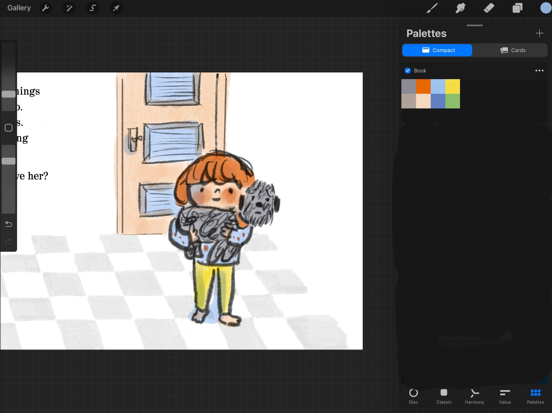
And here’s a tiny detail of the final artwork. You can see that instead of using my usually black ink line, I went for coloured crayon. That’s because black ink can kill subtle colours sometimes so I wanted to try something softer that can reflect the colour of the paints. I can also play with the way I hold the crayons in my fingers to vary the thickness and personality of the line.
I am loving this new adventure into colour. You can do Tania’s free magic colour workshop here. There are more in-depth, life changing, sleep stealing, colour theory films in the courses.


Have you ever decided you are an expert at something and been resistant to advice? Please tell me I’m not the only one! I’m not really into horoscope personality types (unless they paint me in a very flattering light of course, then I’m all in) but maybe it’s my bullish Taurean nature?
love and hugs,
Helenx
I think it’s important to work like an expert,but it’s also important to go into a cocoon and blow ourselves up into a primordial soup every so often only to re-emerge as an expert again.
The new book looks so exciting, I love the character’s hair colour against the green tiles! The whole palette is exciting! I do the exact same with mixing paint, scanning it, eyedropping, testing digitally then painting on paper. It sounds like a faff but I find it streamlines and speeds up the process. Digital colour mixing is a nightmare (to me, anyway!)