


Dear Helen
I've been interested in drawing light/capturing light in my work. Like a dark room with light falling onto a character (I've not yet tried this), or light streaming through a canopy in a forest (I've tried this with a modicum of success). In your post about samples you showed one of your drawings of a girl in bed at night time (so so nice). But how did you do this?
Did you:
colour the whole image first (the bed, the girl, the dog, etc using your normal colour palette) THEN cover the whole illustration in blue for the nighttime darkness and just see what happens to the original colours (the bed, dog etc - their colours automatically darken as the blue is washed over the top)
OR
are you colouring up the room in night time colours so that they automatically look like they are filled with darkness cos you've chosen say a maroon red for nighttime bedspread for example instead of a primary red for the bedspread which it would be its day time colour (am I making any sense??!).
OR
are you actually just drawing the character in the room and then the blue night time inky night on a separate sheet and then scanning that and putting one over the top of the other digitally and using a blending mode?
There are many picture books now where light is captured so eloquently (David Litchfield in the Bear and the Piano for example captures light with such sophistication). The way you show light is very very different but equally as sophisticated. I find capturing light really tricky and I struggle with it. So any tips and tricks you can offer on the subject of light would be most appreciated.
Many thanks and kindest regards
Dear Sabina,
Ah thank you Sabina. You have touched on one of my favourite subjects of all time. I LOVE capturing light and dark, and particularly night time scenes.
Firstly I’ll explain very simply how I did this drawing, step by step. Then I’ll show you the exact materials I used and give you my top (very bossy) tips!
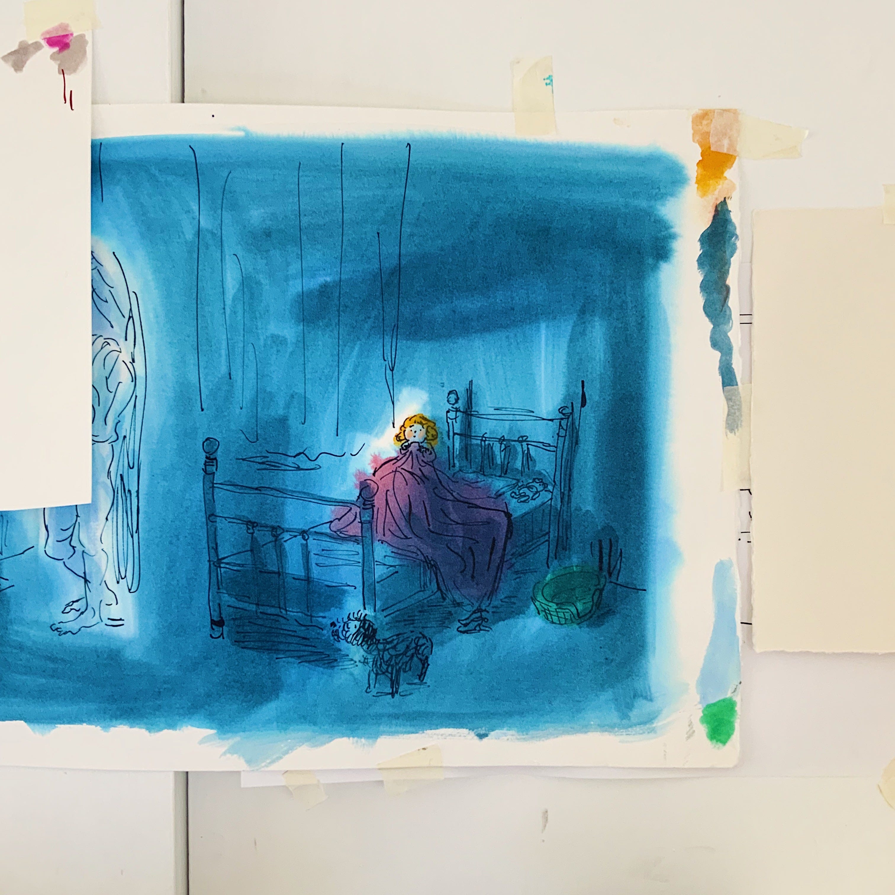
I did a rough drawing using dip pen and ink on thin layout paper. I laid that drawing on my lightbox then put a sheet of watercolour paper over the top.
Firstly I painted the girl’s face with watercolour and let it dry. Only using skin tones, no blue shade, no hair colour yet.
Then I got the biggest brush I own and wet the paper, not too much, no puddles. Just enough that the blue ink will ‘float’ onto the paper. It means I can swoosh the ink around without the paper absorbing it too quickly.
Next I loaded my big brush with blue ink and smooshed it around, leaving a white space where the angel is (sorry you can’t see him very well in this old photo) and where the girl’s face is, just shading one side of her face with watery ink. I also left a slightly lighter area around the dog’s face and the dog bed. All of this using a HUGE brush. It took less than a minute. No messing about!
Then, while the blue ink was still wet, I went back in with more blue ink on my brush and darkened the areas where there wasn’t going to be much drawn detail, like above her head and to the right of the bed.
Before the blue ink had quite dried I painted the pink blanket using watercolour then I let the whole painting dry. Yes I use ink and watercolour together sometimes. They have different qualities and I like ink colour washes because the ink often ‘splits’ making interesting colours at the edges.
Then I roughly blobbed a green patch of watercolour where the dog’s bed will be, and an orangey blob where the girls hair will be.
Remember there are no lines yet, I can only just see the line of the rough drawing through my watercolour paper. I use that as a guide.
The reason colour comes first and line second is that I don’t want to draw the whole picture and then colour it in. That could be quite a stiff drawing. I like the fluidity of leaving the paint to show some edges, and only draw lines where they are REALLY needed.
I let the whole thing dry, added a bit of coral crayon to her cheeks and then drew the black line using a dip pen and waterproof ink.
The reason I use waterproof ink is in case I want to go back in with a bit more watery paint after I have drawn the line.
I finally loaded a smaller brush with blue ink and painted a few darker areas under the bed, at the end of the bed and behind the bedstead.
To paint a night time scene using watercolour or ink I really have to think ahead and decide where the white areas are going to be first, before I even pick up a paint brush. And once it’s done, I NEVER ago back in and fiddle with those white areas. Those glowy areas are what make the darkness dark. It’s all about the contrast.
Bossy tips: THINK AHEAD and NO FIDDLING, that’s the key. You hear me?
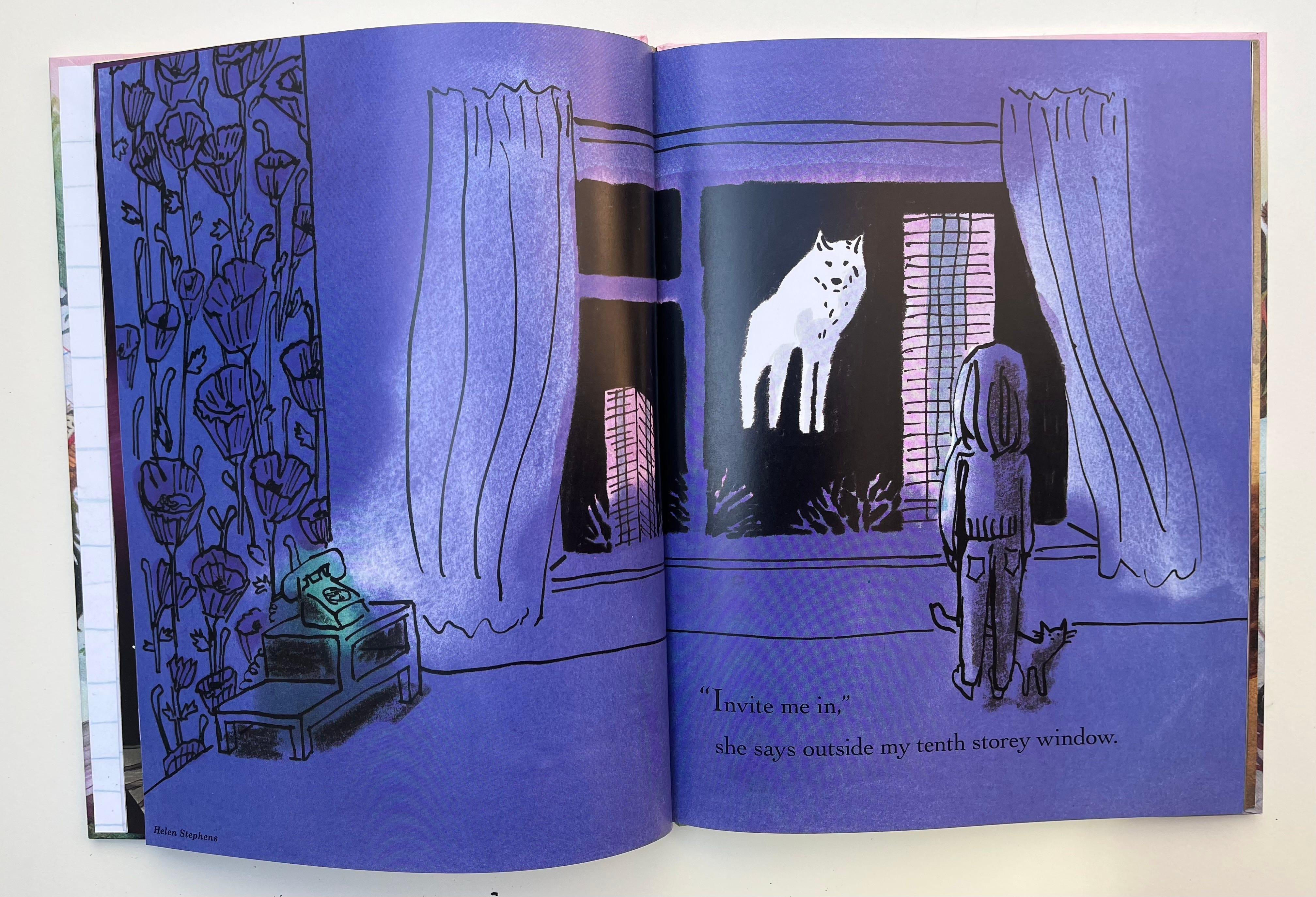
It was a similar process for this illustration, only I added the black ink layer (including the black area outside the window and the ink drawing) separately using Photoshop.
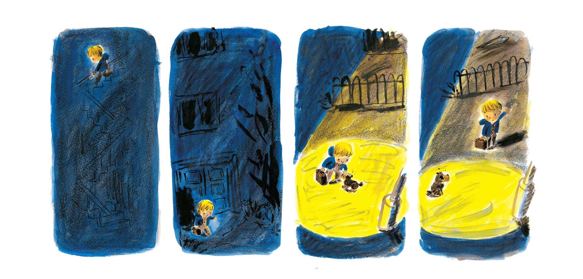
The image below is from Fleabag, a book I made back in 2008. Drawn with watercolour, ink and crayon.
Favourite dip pens: post office nibs or similar
Favourite inks for colour: Doctor PH Martin’s
Paints: Winsor and Newton Watercolour
Paper: Saunders Waterford Hot Pressed
Favourite waterproof ink for using with a dip pen: Higgins Black Magic


Was this useful?
Shall I do a demo of this and we can all paint along together? That would be fun wouldn’t it? We can hold up our drawings at the end and see how it went.
If you have any more questions for my ‘Dear Helen’ column please leave them below.
Bye for now!
love Helenx
Oh this is so useful! I tried digitally colouring an ink sketch recently and was told it looked a bit too ‘coloured-in’; perhaps I will try doing the colour first and inking a new version over the top. Thanks Helen! And thanks Sabina for the great question!
On an unrelated note, I have just bought some of the Procreate brushes you recommended from Retro Supply Co, they have a 50% off offer for Black Friday. This might be useful for other Pencil Pals to know!
This was great! Yes, I think it would be very fun to have you demo and then we practice! Thank you so much!