Welcome, welcome, come on in. I made us a den under my desk, get yourself a cushion and coorie in*. We’re gonna be talking about the picture book making process: more specifically covers!
We are looking at how I designed the cover for my new book Smelly Peggy.
If you missed the first couple in this Bite Sized Picture Book Process series, here they are: (I made them both free for everyone now 😃)
*the Scotts way of saying snuggle in, get yourself comfy.


So, you might remember we have talked about picture book covers before in the Pencil Pals den. Someone sent me this excellent question about which way the character should face on your cover. I decided to open up that post and make it free for everyone, here it is 👇
The cover for Smelly Peggy came quite easily, when I say easily, I mean not too much faffing or over-thinking. It was a nice simple one.
At what stage do you make the cover?
I like to make the cover artwork last, it’s the final job after the inside artwork is complete.
Sometimes publishers push for it to be made really early, before the inside artwork, so that they can trail it in their sales catalogues and on Amazon. But I always resist that. It is much esier to make a brilliant cover at the end, when you know the book inside out: you have drawn the characters a gazillion times and you have a palette that you know works. The danger of making the cover too early is that the palette or the characters change slightly once you start the final artwork.
Anyway, Walker Books are the masters of book covers, they really know their stuff and didn't ask for the cover artwork first.
Smelly Peggy cover decisions
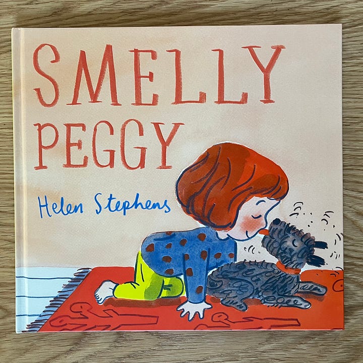
We decided that the relationship between Pie and Peggy was the main deal with this book: Girl, smelly dog, best friends, the end. I promise the story is a LOT better than that 😂 but you know what I mean, the cover had to say it all nice and succinctly.
And in the post I linked above we talked about which way your character should face on a picture book cover: out at the reader, facing left to right (direction of travel to lead us to open the book), face to face with another character, but never (or hardly ever) right to left because it leads the eye towards the spine rather than the book opening.
So at a meeting in Edinburgh, when my art director and editor (Deirdre McDermott and Maria Tunney) were up here for - I want to say - the Edinburgh Book Festival? - we met for a quick cuppa and a chat about the book.
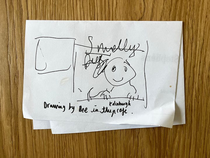
Dee sketched a very quick doodle (above) of Pie and Peggy facing out of the book at us. ‘Maybe Peggy could have her paws up along the bottom edge of the book.’ said Dee. We all agreed that would look great. But a couple of weeks later I did a sketch of Peggy licking Pie on the nose, and we all decided that said ‘smelly friendship’ better than the first idea.
We also liked the composition and thought the text would sit happily above it, so that was it, decision made.
We had a few chats about whether there should be a rug to suggest a horizon line, or the checky tiles from the kitchen inside the book, or just a simple plain background. We quickly agreed the carpet added some nice detail and ran with that.

This is what I love about making picture books, you work as part of a creative team and a few pairs of eyes are better than one pair of ‘too-much-time-working-alone-overthinking-and-can’t-make-up-their-mind-eyes’.
Working alone can be tricky sometimes, you can get too close to a project and over-think things, so I love working in a team. That’s what I love about running The Good Ship Illustration too, three pairs of eyes is better than one. The three bears of the illustration world 🐻🐻🐻
Next was the colour. Walker felt they had done far too many blue covers recently, and fancied a change. That was fine by me, I have a lot of blue covers too. Why is that? Why is blue so popular? Probably because blue sits nicely back behind a character, it doesn't fight for attention.
Anyway, my first instinct was green, but after Deirdre dropped in some colour options, taken from the palette of the book, we all agreed on the dusky pink.
Choosing the typeface
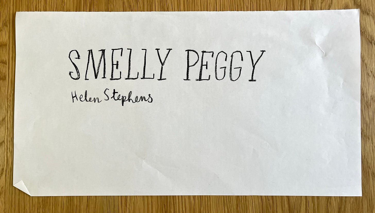
The hand drawn type had been there right from day one. It was in my earliest sketches of Smelly Peggy, so that was an easy decision. I enjoyed drawing some of the serifs pointing in the wrong direction and making the letters sit slightly above or below the line to give it a humorous light hearted feel.
I hand write my name on nearly all of my books. I’m not really sure why. I started doing that a long time ago and it has stuck. I like it. So. There we are.

Send me you Picture Book Process Questions, I love answering them.
Love Helenx


Fascinating to see what goes into the cover! On the occasions when you’ve illustrated another author’s book, how much say does the author have in the cover, or even the character, palette, etc?
Smelly Peggy is becoming a household fave here, and I love getting a geeky peak into your process. Thank you! 💨